SLDS React App - how to start without loosing your mind (twice)

Alright... ehm...
Problem?
One day, you might find yourself in need to use something else to extend your Saleforce.com platform to give it additional features... like use of... webcam? microphone?... or something like that. Salesforce can be (and in most occasions is) very strict in what you can or cannot do in it's environment, and that's completely fine, since it's being built with security in mind.
In my case, it was access to user media devices.
navigator.mediaDevices.getUserMedia()Code above in Lightning Component will error out since Salesforce will nullify mediaDevices before you can even access them.
Solution!
To tackle my problem, I can simply use canvas app which will have functionality I need and embed it inside Salesforce with practically less than zero effort.
Because I like convenient approach where code-less-do-more is must I would like to use similar way to code as in Lightning. Quick search brings me to Salesforce Lightning Design System which apparently have official support for React!
https://react.lightningdesignsystem.com/
They have most of the components implemented... and did I say it's supported?
Oh boy, how I was wrong. Most of guides being outdated and my limited skill with Babel, React and other frameworks were really showing up. I lost my mind couple of times... defeated, yet I didn't lost my hope. After another few tries of build from scratch, delete, start again, I finally made it work!
Here is how...
This guide assuming that you have node.js and yarn installed.
Starting with creation of the app. Using tool called create-react-app. I also prefer yarn before npm.
yarn create react-app slds-react-app --typescriptAdd SLDS.
cd slds-react-app
yarn add @salesforce-ux/design-system @salesforce/design-system-react
Now wire SLDS with React app
mkdir -p public/assets
cp node_modules/@salesforce-ux/design-system/assets/styles/salesforce-lightning-design-system.min.css public/
cp -r node_modules/@salesforce-ux/design-system/assets/fonts public/
cp -r node_modules/@salesforce-ux/design-system/assets/icons public/assets
This will:
- Create assets folder in your public folder
- Copy base css styling to your public folder
- Copy all fonts
- Copy all icons
Wire stylesheets with React app
For that, you'll need to add this line in header of your index.html.
<link rel="stylesheet" type="text/css" href="%PUBLIC_URL%/salesforce-lightning-design-system.min.css">Last step will be declaration of slds modules...
mkdir src/tsds
echo "declare module '@salesforce/design-system-react';" > src/tsds/salesforce-design-system-react.d.ts
And that's it! Done...
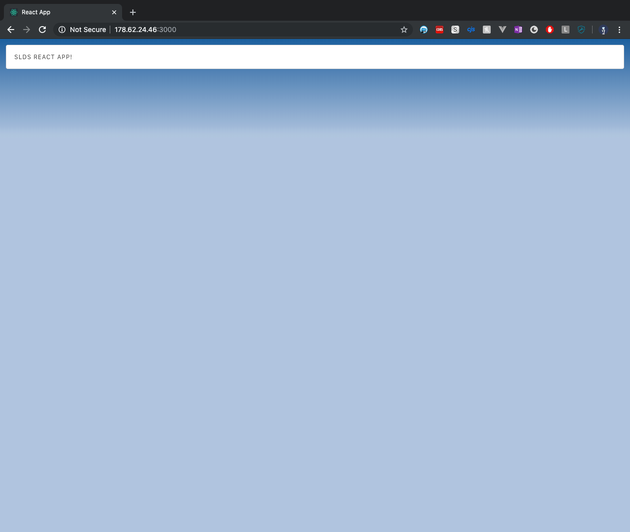
To verify functionality, add some SLDS components in your App.tsx like so...
import React from 'react';
import './App.css';
import { BrandBand } from '@salesforce/design-system-react';
const App: React.FC = () => {
return (
<BrandBand
id="brand-band-lightning-blue"
className="slds-p-around_small"
theme="lightning-blue"
>
<div className="slds-box slds-theme_default">
<h3 className="slds-text-heading_label slds-truncate">SLDS React App!</h3>
</div>
<br />
</BrandBand>
);
}
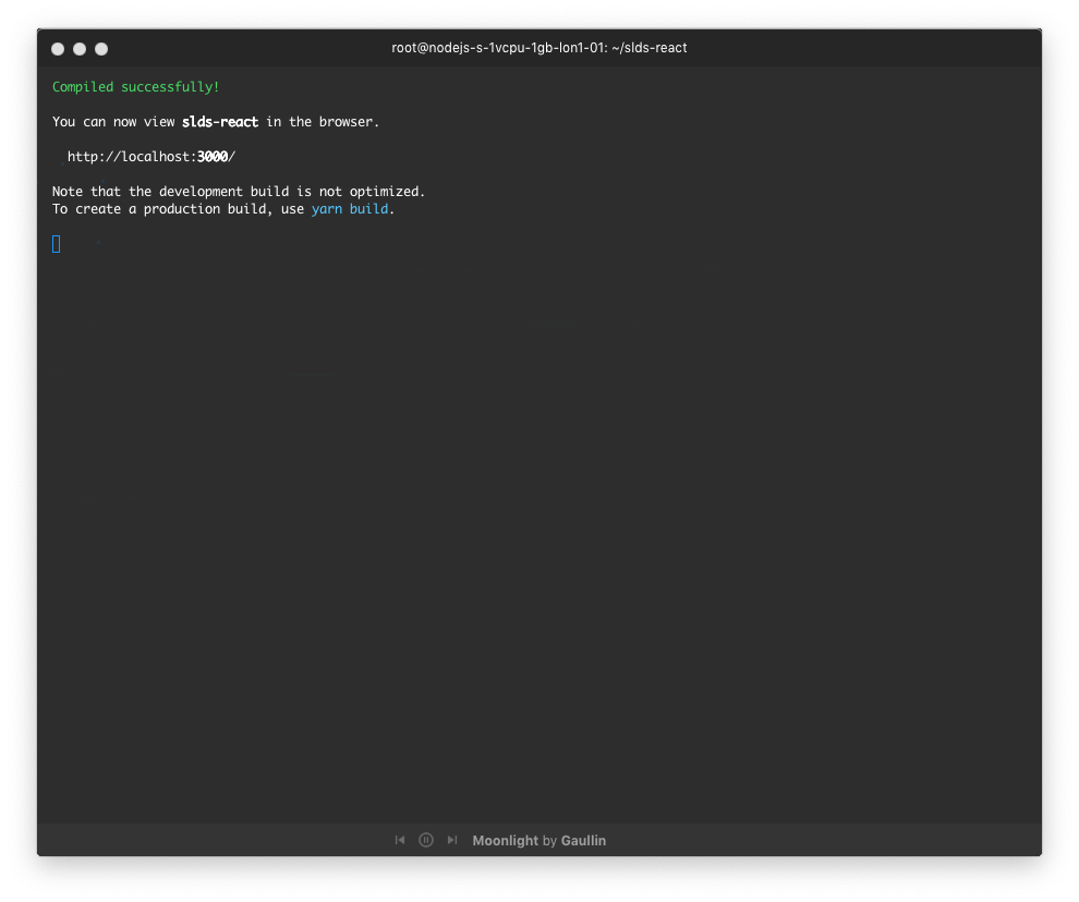
export default App;hit `yarn start` and you should get result like shown below.
Hope you find this "Big Brain Time" useful. 🥳
All code can be found here >> https://github.com/Dhanielk/slds-react-app